
With the launch of the latest addition to the My Outdoor Alphabet world, I wanted to share a little behind-the-scenes peek into how one of these things comes to life. Sound good? Let's go.
It all begins with getting outdoors.
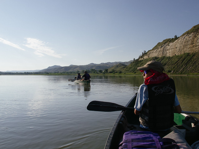
For the Paddler's Alphabet, it started with a free canoe someone gave my young family nearly 15 years ago. Where it really came to life however, was during a 50 mile canoe trip my boys and I took down Montana's Missouri River with their grandfather. As we prepared for the trip and spent time together on the water, we were setting the foundation for this poster without even trying. The seed was planted, the trip was amazing (check the photos here), and it made it very easy to roll into the next phase—the alphabet itself.
For each of the posters—current offerings as well as those yet to come—I create a list. An A to Z list where I can simply write in the words that come immediately to mind, as well as figure out the blank spots and where I'll need to do some research. There's usually more than one word per letter, but in the end it all comes down to what works best. Does it resonate with the core audience? Does it highlight something unique or significant in the sport? Can it be simplified and iconified? If yes, then onward.
Once the list is in good shape and there's something for each letter, I get out the sketchbook.


I'll draw out a few pages full of empty boxes, and armed with my letter list, jump right in and begin to simplify, iconify, sketch, and doodle. Most letters go through multiple rounds of revisions and approaches, but some get figured out right away. Not every letter gets the full sketchbook treatment, but most do, and it's my favorite part of the process. Packing along a pencil and a few colors to be able to bring a letter to life wherever I'm at is fun, and watching the concepts evolve over time as I turn the pages is pretty cool.
From the sketchbook I move into Illustrator. This becomes the sandbox for the next level of detail and exploration, as colors come to life and the nuances of each illustration are explored and adjusted, and sometimes completely redone.

Rough shapes are blocked out, and the poster becomes a mish-mash of vector shapes and bezier curves and things that work and things that don't quite work. Because I'm only working with three ink colors, I'll work in some textures or half-tone dots to keep things interesting. The red color that's been a part of each poster is also overprinted to give me another option for depth. As the illustrations progresses, the colors are separated into individual layers that will become the screens for printing.

From there, once the letters are in place, the copy is proofed, and the color separations are triple checked—it's off to the printer. For quite a while the posters were done up the road in Big Sky, but we outgrew that operation and are now working with the fine folks of The Half and Half in Columbia, South Carolina. After the files are in their capable hands, I can sit back and get shipping tubes ready while they work their magic on the French Speckletone paper stock.

Eventually though, the posters end up in your hands. That's the point of all this, right? To inspire a life outdoors—one letter at a time. To celebrate the building blocks of our outdoor passions, and keep that stoke alive not only for ourselves, but our families and friends. The Paddler's Alphabet is only the latest expression of that spirit—and here's to many more.